
Streamers Speak
App Design
A Spotify Feature Concept
My process began with research and discovery, where I explored user needs, analyzed competitor platforms (Pandora, Twitter/X, Instagram), ideated on interface and content hierarchy, and identified opportunities to bring more community-driven interaction into Spotify.
From there, I moved into ideation and low-fidelity wireframes, sketching simple layouts to test core concepts like commenting, ratings, and cultural context. These early explorations focused on structure and information hierarchy rather than visuals.
Next, I developed prototypes, refining navigation, interaction flows, and content placement in grayscale. This stage allowed me to validate usability, test how features would live within Spotify’s interface, and ensure the design felt cohesive.
Finally, I translated these learnings into high-fidelity mockups aligned with Spotify’s brand identity. The polished designs introduced community features, Streamers Speak (comments), Ratings, and In the Media, as a seamless extension of the listening experience. Each feature directly tied back to research insights, making the final product both user-centered and culturally relevant.

Stage 1: Ideations & low fidelities
I ended up coming up with three main focuses:
- Lyric interaction to highlight what parts of a song high interaction
- comment ability / ratings to bring the Spotify community together
- vetted media links to show song social context
The focus was on layout clarity and interaction flow, without the distraction of color or polish. I translated the rough sketches into grayscale blocks, refining hierarchy and spacing.
-
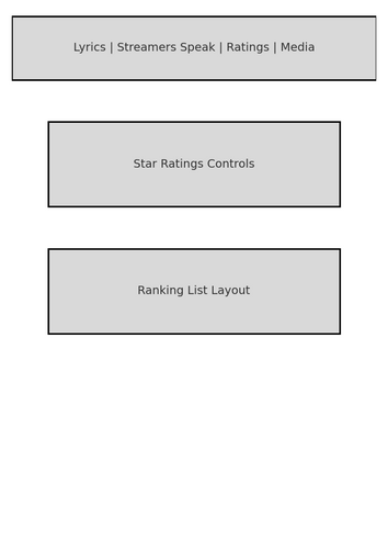
Navigation Tabs: A horizontal bar (“Lyrics | Streamers Speak | Ratings | In the Media”) shows how users can toggle between different views without leaving the Now Playing screen.
-
Comments Module: Structured as a vertical feed for user posts, with an input field for adding new comments.
-
Ratings Module: Early structure for star ratings and ranked song lists. Instead of just placeholders, the layout mimics real data entry and list hierarchy.

Stage 2: Structuring Interactions & Content Hierarchy

At this stage, I focused on mapping out how users would engage with the feature: comments, threaded replies, ratings, and ranking lists. These mid-fidelity sketches were less about visual polish and more about ideating functional components like buttons, feeds, and interactive lists. This allowed me to quickly test information hierarchy and ensure that the most engaging actions, rating, ranking, and commenting, felt natural and easy to access.
Stage 3: Benchmarks (Other UI Explorations)
Pandora Music


X (Twitter)

I analyzed Pandora, X, and Instagram to understand how leading platforms approach discovery, community, and engagement. Each app offered useful design patterns, but also revealed areas where Streamers Speak could differentiate itself.
-
Pandora showed how clarity in navigation and consistency in sharing options build user trust.
-
Twitter/X highlighted the power of real-time conversations and the importance of filters to manage large volumes of content.
-
Instagram demonstrated how visual sharing and ephemeral content create habits and encourage users to return daily.
What I Learned
-
Discovery should be seamless. Users expect to find content quickly through intuitive search, filters, and recommendations.
-
Community is central. Strong discussion features and the ability to control how/where you share content make users feel empowered.
-
Freshness keeps users engaged. Ephemeral, story-like features add urgency and bring people back to the app regularly.
-
Consistency matters. Repeated design patterns across flows reduce friction and help users feel confident when navigating.This research directly influenced my mid- and high-fidelity designs by reinforcing the need for:A simple search/discovery flow.Threaded, filterable conversations.
Stage 4: Component Walkthrough


Walking through each component gave me a clear picture of how Spotify’s interface works at a functional level. By breaking down the purpose of every button and mapping out the user flows, I was able to see not just how users interact with the app, but also why Spotify chose certain design decisions. This helped me identify opportunities where my own feature could be seamlessly integrated without disrupting the familiar experience users already know and trust. It was less about reinventing the wheel and more about understanding the rhythm of their interface so that my addition felt natural, intuitive, and valuable.
Stage 5: Storytelling through UI


This set of user journeys highlights how the app adapts to Gregory’s needs in different contexts, whether as an older person trying to keep interactions simple, someone wanting to stay connected without feeling outdated, or a driver needing minimal distractions. The flows emphasize reducing taps, surfacing familiar cues, and providing clarity at every step. For example, adding a song to a playlist is structured but could be streamlined to fewer taps; recommendations are personalized to avoid alienation by focusing on familiar artists and genres rather than overwhelming novelty; and driving mode simplifies navigation into large, tappable cards to minimize cognitive load. Overall, the analysis shows a balance between accessibility, personalization, and safety, aiming to reduce friction while ensuring Gregory feels capable, current, and in control of his listening experience.
Stage 6: High Fidelity Wireframes

The Streamers Speak button is the entry point for interacting with the feature. Designed as a small, unobtrusive icon, it seamlessly blends with Spotify’s existing UI while remaining easy to access within the song navigation.

The Lyrics section emphasizes user interaction by visually mapping the number of comments tied to each verse. Verses with more activity are represented with larger markers, making popularity instantly recognizable. This design allows users to quickly identify which parts of a song spark the most conversation and cultural relevance, while still being able to sift through every lyric in context.

Streamers Speak is both the name of the tab and the central concept of the extension. At its core, it allows listeners to comment directly on songs in real time, creating a shared, community-driven experience. By blending the familiarity of a traditional comment section with the flow of music, it introduces the most direct and intuitive way to bring community into the interface.
The design is clean, interactive, and social by nature—users can highlight specific lyrics or moments, add their thoughts, and engage with others’ reactions. The inspiration came from X (Twitter), where lightweight, conversational threads make community engagement feel natural. Streamers Speak adapts that dynamic into the music space, transforming listening into a more social, participatory act rather than a solitary one.


Rankings provide a fast, visual way for users to absorb community sentiment around music. This feature allows listeners to see how others ranked their favorite songs at a glance, giving immediate context to what tracks stand out. Beyond just viewing, users can interact with ratings by liking others’ rankings, building an additional layer of engagement and validation within the community. Importantly, users can also create and share their own rankings, making the experience both participatory and personalized.
This quick-scan format not only streamlines discovery but also reinforces the social aspect of music listening, letting people compare tastes and spark conversations.
On top of that we have the amount many stars out of 5 does the song have. This is also visible on the comment section of the song next to people's names. the scoring is listed right next to each song so its very easy to look at a list of songs and see how they compare.

In the Media provides a curated layer of cultural context within Spotify. By surfacing vetted, relevant media tied to each song, such as articles, interviews, or social posts, the feature ensures that listeners can trust the information they see while staying connected to the broader cultural conversation around the music.
This not only combats misinformation but also gives users a reliable way to tap into what’s being said outside the app, making Spotify a one-stop destination for both listening and cultural engagement.

Beneath the search bar, a trending pop-up highlights the most talked-about song or album in real time, the top comment, rating, and a media link. This feature acts as a cultural pulse, surfacing what’s generating buzz so users can stay “in the know.”
Much like Instagram’s glowing story rings, the dynamic and time-sensitive nature of this element creates a sense of urgency. Users feel compelled to check it daily, ensuring Spotify becomes not just where they listen, but also where they stay connected to the cultural conversation.
Streamers Speak
A New Spotify Feature
This ad provides a clear, in-depth visualization of the Streamers Speak feature, outlining the core problem, highlighting user pain points, and demonstrating how the solution directly alleviates them
This concludes my design process!