
BEYOND THE GLASS
Company
New England Aquarium (NEQ)
Role
UX/UI Designer
Timeline
8 Months
Figma · Brand Identity Design · App Design Pitch · Game Design
OBJECTIVE
I set out to design an app for the New England Aquarium that turns a passive visit into a personal one, helping families, curious learners, and conservation-minded visitors connect with the animals beyond the glass.
SOLUTION
I designed an app specifically tailored to
help visitors better educate families, navigate exhibits, learn more about the animals, and discover hidden gems within the Aquarium.
My goal was to turn moments of confusion or inconvenience into opportunities for learning, excitement, and connection. I then pitched the app to the Aquarium’s leadership, presenting my research, wireframes, and high-fidelity mockups. As a result, the process of integrating the app into the Aquarium’s operations is in progress. This project not only showcased my ability to combine user research, design thinking, and technical skills, but also reinforced the value of observing real-world interactions to inspire meaningful solutions.
Mobile app walk through


RESEARCH
I spent two months researching how people experience the New England Aquarium, through five semi-structured visitor interviews, role and goal mapping, and a comparative analysis of existing apps. I wanted to understand not just what visitors needed from an app, but why they visit, how they engage with exhibits, and how their phones already fit into the experience.
Visitor Interviews
65 participant data, 5 key participants are listed here

Key Quotes:
“It’s an amazing way to observe marine animals I’d otherwise never see outside of research.”
“It’s all about my kids! They get so excited seeing sea creatures in real life.”
“I love the experience of aquariums, how they use lighting, layout, and digital screens to create a whole new world.”
UI Explorations
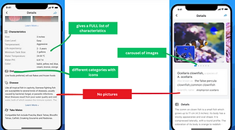
10+ App explorations, 3 examples are shown here


3.8 / 5
Emotional connection score
This suggested that emotional connection isn't equally important to every visitor, but when it exists, it can make the experience more memorable and meaningful.
The strongest responses came from conservation-minded participants, who saw emotional connection as a pathway to empathy and action. Others were more motivated by aesthetics, entertainment, or simply seeing animals up close.
Key insight:
Rather than competing with visitors' phones, an aquarium experience could intentionally integrate the behaviors they are already doing.
Every participant described using their phone during a visit, but for different reasons.:
Photography: Capturing animals and exhibits
Learning: Looking up unfamiliar species or conservation information
Navigation: Checking maps and finding upcoming activities
Planning: Checking show times and events
Sharing: Sending photos and videos to friends
Pain Points
Information can feel too shallow
Visitors wanted more depth than traditional exhibit plaques that just provided animal descriptions
Families struggle with navigation and engagement
Parents are balancing directions, children, and finding activities that keep everyone interested
Crowds can diminish the experience.
Long lines, congestion, and noise make it harder for some visitors to engage with exhibits.
Conservation activities are often buried
Conservation-focused visitors wanted to know more about ways to get incolved
Inactive animals create dead moments
When animals aren't visible or moving, visitors can quickly lose interest
Visitors already take photos, search for information, follow maps, share videos, can view conservation efforts on the website, and ask staff questions.
The opportunity was to connect these fragmented behaviors into a single experience that could adapt to different visitors and make each animal feel more personal.
Workflow 1
As a Visitor, I want to scan an animal exhibit so I can learn more about its backstory, personality, and conservation status.
Steps:
-
User opens the app and sees a "Scan" button on the home screen.
-
User points their phone's camera at an animal or exhibit plaque.
-
The app detects the exhibit and begins processing.
-
App loads the animal's profile with details like name, age, species, personality, backstory, conservation efforts, and images/videos.
-
User explores additional content, such as feeding schedules, related species, or fun facts.
Completion Indicator: User successfully views the full animal profile and has the option to save it or share it.
Workflow 2
As a Parent, I want to engage my child with interactive activities so they can stay entertained and learn about marine life in a fun way.
Steps:
-
User selects the "Kid Mode" option on the home screen, which provides interactive learning activities.
-
App suggests a scavenger hunt or quiz based on the animals in the aquarium that day.
-
Child completes tasks, such as spotting a specific animal, answering a question, or watching a feeding session.
-
The app provides rewards, like digital stickers, fun animations, or achievement badges.
Completion Indicator: Child earns a digital reward, and the app suggests new activities to continue engagement.
Workflow 3
As a visitor who may or may not already follow marine conservation, I want to discover the aquarium's rescue and conservation work while I'm there, so I can learn what's happening and find easy ways to get involved.
The aquarium already shares conservation news on its website, but visitors usually have to go looking for it, and many don't know these efforts exist.
Steps:
-
User comes across conservation content in the app, either through a highlight on the home screen or through the nav bar.
-
App displays a feed of recent conservation stories, such as rescues, rehabilitations, and releases, alongside upcoming events like beach cleanups and volunteer programs. Also shows your history of events attended which you can gain points through.
Completion Indicator: A first-time learner reads a conservation story, or an advocate saves, signs up for an upcoming event.
DESIGN PROCESS
I dedicated three months to an iterative design. I began with sitemapping and wireframing, sketching out multiple variations of layouts and user flows to understand how visitors would naturally interact with the app.
This sitemap helped me understand high level functionality of the app.

Home Screen Brain Drawings
This is a quick look into a first draft of how I explored different home pages. I wanted the three navigations to be clear. I wondered how could playing with hierarchy and button location produce the most successful experience keeping all users in mind.


The first sequence of pages explores different navigation approaches for the app. The first concept begins with a central scan page, with an expandable menu for exploring additional functions. The second concept simplifies the experience by opening directly to a landing page with the three core app functions, essentially acting as a straightforward navigation bar. The third concept experiments with button composition while also introducing a profile button, giving users a more personalized entry point.
Current Aquarium Offerings Idea Inspiration
I looked at the current NEQ website dropdown of animals on the home navigation I had an interesting idea to somehow implement the animal information into a high level for the home page. I also wanted to implement interactivity.

Paper Wireframe Ideations: click arrows to see each functionality
Workflow 1: Scan

Low Fidelity Wireframes
Workflow 1: Scan

APP DESIGN

I dedicated three months to an iterative design process that combined creativity with validation. I began with thourough sitemapping and wireframing, sketching out multiple variations of layouts and user flows to understand how visitors would naturally interact with the app.
I conducted rounds of user testing, observing how real people navigated my prototypes, listening to their feedback, and using those insights to make thoughtful adjustments. This cycle of designing, presenting, and testing allowed me to uncover what worked best, what needed to evolve, and ultimately shaped the app into a solution grounded in both research and real user needs.
The sitemap is broad at the top (Scan, Kid Mode, Conservation, Profile, Home, Search, My Account, Login, Map), which gives users clear entry points.
Each section branches into deep, content-heavy structures (e.g., Conservation → Feed with Updates → Endangered List, Rescue Stories, etc.). This is good for rich exploration, but it risks overwhelming users if navigation isn’t streamlined.
Consistency: Profile appears twice (standalone + under My Account). This could cause confusion — consolidating these might improve clarity.
My Workflows
-
Scan → Upload Photo → Animal Profile Page
-
Very direct and user-friendly. The scan flow feels like the primary feature and is designed to deliver quick gratification.
-
-
Kid Mode → Scavenger Hunt / Quizzes / Flashcards / Rewards
-
Nicely gamified and tailored to younger audiences. Clear motivation loops (learn → play → reward).
-
-
Conservation → Updates / Rescue Stories / Ways to Get Involved
-
This is a mission-driven pathway. Great for aligning with emotional design — users who care about conservation get narrative-rich, value-building content.
-
Elevator Pitch
For kids, adult aquarium visitors, and conservationists who want a more engaging and interactive way to connect with marine life, Behind the Glass is an educational aquarium app that combines scanning technology, gamification, and real-time conservation updates to create an immersive aquarium experience. Unlike Fathomverse, which focuses on VR-based exploration, PictureFish, which is limited to fish identification, and JellyWatch, which centers on citizen science tracking, Behind the Glass enhances real-world aquarium visits with interactive learning, personalized rewards, and exclusive conservation insights.
The first sequence of pages explores different navigation approaches for the app. The first concept begins with a central scan page, with an expandable menu for exploring additional functions. The second concept simplifies the experience by opening directly to a landing page with the three core app functions, essentially acting as a straightforward navigation bar. The third concept experiments with button composition while also introducing a profile button, giving users a more personalized entry point.
I ultimately chose idea #2 because it balances personal progress (visit history, kid updates) with immersive discovery (species map), making the homepage feel both useful and engaging right away.
Workflow Digital Wireframes
Workflow 1: Scan


Scan Feature
Balancing Personal Progress with Exploration
The homepage leads with personalized context, past visits and KidMode progress, then invites exploration through a species map highlighting global animal connections. An underwater gradient reinforces the aquarium theme, while a fixed bottom nav keeps core features (Home, Scan, Kids, Updates) easily accessible.
Making Discovery Interactive
The scanning screen turns the aquarium visit into an active moment of discovery. A live bounding box lets users "capture" species in real time, with instant feedback ("Looks like Sally, tap to see") guiding the next step. Options to take a photo or upload one add flexibility, making learning feel game-like and turning the visit into a hands-on, memorable experience.
Storytelling + Education.
After identification, the user lands on a species profile that blends scientific accuracy with storytelling. Giving each animal a name, age, and personality traits builds emotional connection, especially for kids. Information flows from quick personal facts: species/conservation details, playful personality, appealing to both casual visitors and those seeking depth. A circular hero image keeps the animal as the visual centerpiece.
Workflow 2: KidMode


Kids Mode
Entry Point
The Kids Mode offers three clear paths: Marine Twin Quiz, Games, and Rewards. The layout is kept simple with bold icons and minimal text so children can easily navigate. Whimsical illustrations of sea life (jellyfish, whales) anchor the design in the underwater theme.
Design Strategy
Kids Mode is designed around three principles.
-
Engage: Simple games and quizzes keep children curious and entertained.
-
Personalize: By giving marine life names and personalities, the app makes education more relatable.
-
Reward: Real-world incentives strengthen motivation and create unforgettable experiences.
Together, these elements ensure Kids Mode is more than just a side feature, it’s a core part of the app’s mission to educate and inspire children and ease the aquarium experience for parents.
Workflow 3: Conservation Updates


Conservation Section
To extend the app’s impact beyond scanning and games, I designed an Updates section that connects visitors to real-world conservation efforts. The goal was to move users from passive learning toward active participation, whether that means staying informed, attending events, or volunteering.
Updates Hub: Stories, Events, and Opportunities
The Updates hub is designed to feel like a dynamic newsfeed. At the top, users see highlights of recent conservation wins, such as rescued sand sharks or baby sea turtles released after storms. Below, upcoming opportunities like beach cleanups and volunteer programs are displayed with clear dates, locations, and calls to action. The mix of narratives and actionable items ensures both casual visitors and motivated advocates can engage at their own pace.
Expandable Content: Depth Without Overwhelm
Each card in the feed is tappable, leading to a dedicated page for deeper detail.
For example:
-
A conservation story expands into a full article with images, offering transparency into the rescue process.
-
A beach cleanup expands into a list of upcoming and past events, encouraging repeat participation.
-
A volunteer program expands into details with a clear “Sign Up!” button, making commitment easy.This progressive disclosure design keeps the homepage clean while still supporting users who want to dig deeper.
Design Strategy: From Awareness to Action
The Conservation & Updates flow is guided by three principles:
-
Inform: Provide digestible, real-time stories about conservation efforts.
-
Engage: Use visuals and headlines to spark curiosity and empathy.
-
Activate: Offer clear, actionable opportunities (cleanups, volunteer programs) to turn awareness into hands-on involvement.
Final App Walkthrough
Watch the video below to watch how the app comes together!