
Beyond The Glass
NEW ENGLAND AQUARIUM APP
An improved immersive experience for aquarium visitors
User Research · Logo/Brand Design · Gamification Design Content · Stakeholder Analysis
PROBLEM SPACE
The New England Aquarium is a place I visit often, and over time, I began to notice patterns, challenges, and areas where the visitor experience could be improved. By immersing myself in the environment, watching how people interacted with exhibits, navigating the space, and accessing information, I identified a range of opportunities to make the experience more engaging, accessible, and seamless.
SOLUTION
With these insights, I designed an app specifically tailored to address these pain points. The app includes features to
help visitors better educate families, navigate exhibits, learn more about the animals, and discover hidden gems within the Aquarium.
My goal was to turn moments of confusion or inconvenience into opportunities for learning, excitement, and connection. I then pitched the app to the Aquarium’s leadership, presenting my research, wireframes, and high-fidelity mockups. As a result, the process of integrating the app into the Aquarium’s operations is in progress. This project not only showcased my ability to combine user research, design thinking, and technical skills, but also reinforced the value of observing real-world interactions to inspire meaningful solutions.
Mobile app walk through


RESEARCH
I dedicated over two months to in-depth research and discovery, fully immersing myself in every aspect of the project before moving into design. My goal during this phase was to build a strong foundation, understanding not just what the app needed to do, but also why it mattered and who it was for.
I conducted and analyzed multiple user interviews, speaking with a variety of audience groups including parents, children, educators, and aquarium visitors. These conversations helped me uncover behavioral patterns, motivations, and frustrations, insights that became essential in shaping the app’s direction. I also worked to
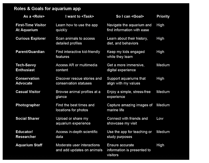
define clear user roles and goals, identifying primary personas such as families seeking interactive learning, children looking for engaging play, and adults interested in conservation impact.
I mapped out detailed app workflows, carefully charting how different users might navigate through features like scanning, Kids! Mode, and conservation updates. This exercise highlighted pain points, opportunities for delight, and places where simplicity was crucial for accessibility.
By the end of this research phase, I had built a clear vision of the problem space and opportunity areas. More importantly, the process grounded my design decisions in evidence rather than assumptions. Every choice I made, from typography to navigation hierarchy, was directly connected to the experiences and needs of the users. This deliberate approach ensured that the final product didn’t just look polished, but also felt intuitive, meaningful, and aligned with the mission of the aquarium.
Interviews
To better understand how people experience aquariums, I conducted five semi-structured interviews with visitors representing different motivations and engagement styles. I wanted to understand what draws people to aquariums, how they interact with exhibits, how they use technology during their visits, and where the experience falls short.

What I Heard
1. People come to aquariums for very different reasons
Some visitors are there to learn, some to spend time with family, and others are drawn to the visual and immersive qualities of the environment.
“It’s an amazing way to observe marine animals I’d otherwise never see outside of research.”
“It’s all about my kids! They get so excited seeing sea creatures in real life.”
“I love the experience of aquariums, how they use lighting, layout, and digital screens to create a whole new world.”
Key insight:
There isn't one “aquarium visitor.” The experience needs to support different motivations, from deep learning to casual exploration.
2. Visitors engage with exhibits in fundamentally different ways
I found three broad engagement styles
The Deep Diver:
Reads plaques, watches presentations, and seeks additional information from staff.
The Explorer:
Moves through the space visually, focusing on animals, exhibit design, and interactive elements.
The Interactive Learner:
Looks for hands-on activities, touch tanks, games, and experiences that keep them actively engaged.
This revealed an opportunity to move beyond the traditional “read the plaque” model and create multiple pathways for learning.
3. The phone is already part of the aquarium experience
Every participant described using their phone during a visit, but for different reasons.
-
Learning: Looking up unfamiliar species or conservation information
-
Navigation: Checking maps and finding upcoming activities
-
Photography: Capturing animals and exhibits
-
Sharing: Sending photos and videos to friends
-
Planning: Checking show times and events
One participant described seeing an unfamiliar species and immediately searching for more information about it.
Key insight:
Rather than competing with visitors' phones, an aquarium experience could intentionally integrate the behaviors they are already doing.
Pain Points
The interviews also revealed several recurring frustrations:
-
Information can feel too shallow. Visitors interested in marine biology wanted more depth than traditional exhibit plaques provide.
-
Families struggle with navigation and engagement. Parents are balancing directions, children, and finding activities that keep everyone interested.
-
Crowds can diminish the experience. Long lines, congestion, and noise make it harder for some visitors to engage with exhibits.
-
Conservation stories are often buried. Conservation-focused visitors wanted to know more about rescue, rehabilitation, and the individual animals behind those efforts.
-
Inactive animals create dead moments. When animals aren't visible or moving, visitors can quickly lose interest.
What Visitors Wanted
When asked what they would add with a “magic wand,” participants consistently asked for more ways to go beyond simply looking at an animal.
Ideas included:
-
Behind-the-scenes access to aquarists
-
More hands-on activities for children
-
Individual animal stories and personalities
-
Rescue and rehabilitation histories
-
Scheduled feeding experiences
-
Conservation information
-
Species databases
-
Interactive scavenger hunts
-
Animal photos and videos showing growth over time
These ideas pointed toward a larger opportunity:
turning individual animals into stories rather than simply presenting them as exhibits.
Emotional Connection
I also asked participants to rate how important it was to feel connected to the animals on a scale of 1–5.
Average importance rating: 3.8 / 5
The strongest responses came from conservation-minded participants, who saw emotional connection as a pathway to empathy and action. Others were more motivated by aesthetics, entertainment, or simply seeing animals up close.
This suggested that emotional connection isn't equally important to every visitor, but when it exists, it can make the experience more memorable and meaningful.
Synthesizing the Research
After reviewing the interviews, I clustered recurring observations into five core themes:
Education & Learning
Information depth, Conservation awareness, Multiple learning styles
Engagement & Interaction
Hands-on activities, Storytelling, Staff engagement, Interactive content
Navigation & Accessibility
Visitor flow, Maps, Crowds, Noise, Wayfinding
Emotional Connection
Animal stories, Personal histories, Conservation impact, Behind-the-scenes access
Aesthetics & Enjoyment
Visual appeal, Photography, Animal activity, Immersive technology, Social sharing
Visitors already take photos, search for information, follow maps, share videos, and ask staff questions. The opportunity was to connect these fragmented behaviors into a single experience that could adapt to different visitors and make each animal feel more personal.
This became the foundation for the next stage of the project.
Roles and Goals
Workflows


App UI Exploration
Before beginning the wireframing process, I conducted a comparative analysis of existing app interfaces with goals similar to mine. They are separated by workflow. This allowed me to identify what design elements worked well, where users might face friction, and which patterns could inspire my own approach. By critically noting strengths and weaknesses in these interfaces, I built a foundation of insights to guide my design decisions.
Workflow 1 App Exploration:
Letterbox


ESPN


Workflow 2 App Exploration:


Fathomverse
Picturefish


Jellywatch


Workflow 3 App Exploration:
WWH


CleanSwell


New York Times

Research Conclusion
I started this research expecting visitors to want more information, richer plaques, deeper species facts, more content. What I found instead was that visitors already had access to plenty of information; what they lacked was a way to make it feel personal, timely, and connected to their own experience in the moment. The five themes that emerged, education, engagement, navigation, emotional connection, and aesthetics, weren't competing priorities to balance, but different entry points into the same underlying need: visitors wanted the aquarium to meet them where they already were, whether that meant a parent juggling two kids and a map, a conservation-minded visitor looking for a deeper story, or a casual visitor just taking photos.
This reframing, from "add more information" to "make existing behaviors more meaningful," became the foundation every design decision in this project was measured against.
LOGO & VISUALS

When designing the logo for the app, I explored many different directions, experimenting with various moods, type treatments, and visual metaphors. My goal was to create something that not only felt modern and engaging but also instantly communicated its connection to the aquarium. I wanted users to recognize, at a glance, that this app was tied to the experience of being “beyond the glass,” immersed in marine life and discovery.
In addition to the logo, the overall visual system needed to be carefully considered. The design had to feel clean, professional, and approachable, while still reflecting the aquarium’s identity. I pulled inspiration from the aquarium’s existing branding and physical environment, ensuring consistency between the app and the in-person experience. The color palette, typography, and background imagery were all chosen to align with the aquarium’s visual language, deep ocean blues, aquatic gradients, and minimal but impactful iconography.
Ultimately, both the logo and visuals were designed with the same purpose: to create a cohesive, recognizable brand system that felt immersive, trustworthy, and reflective of the aquarium’s mission to educate and inspire.
Logo Sketches

Logo Exploration
When developing the logo for Beyond the Glass, I wanted to capture the essence of the aquarium experience while keeping the design versatile enough to work across digital and physical touchpoints. I began by sketching a wide range of ideas that explored different moods and metaphors, from literal marine imagery to more abstract visual systems.
Whale Motifs: Several concepts centered around whales and whale tails as framing devices. Whales are iconic, majestic marine animals, and their tail or body naturally creates curved shapes that could hold or surround the text. These designs leaned more narrative and family-friendly, making the brand feel approachable and connected to ocean storytelling.
Bubbles & Abbreviations: Another set of sketches experimented with the abbreviation BTG inside bubbles. Bubbles are immediately recognizable symbols of being underwater, while also adding lightness and motion. In one concept, a fish exhales bubbles that spell out “B T G,” blending illustration with typography. This direction felt modern, flexible, and particularly well-suited for digital applications like an app icon.
Fluid Shapes & Integrated Fish: A third direction explored fluid, splash-like shapes and fish integrated into typography. The splash forms conveyed energy and excitement, almost like a playful stamp. In another sketch, a fish silhouette was used in place of a letter, merging the brand name with a clear marine symbol. Circular badge concepts with fish enclosing “BTG” also emerged here, pointing toward a bold emblem style.
By sketching across these three directions, literal, symbolic, and abstract, I was able to explore a spectrum of possibilities. Some leaned more illustrative and family-focused, while others offered the clean versatility needed for branding. This process allowed me to test how far the logo could stretch, and ultimately helped me identify the balance between playfulness and clarity that the final mark needed to achieve.
Type Explorations

For the type exploration, I focused on keeping the design clean, simple, and highly legible. Since this app is designed for a wide audience, including families, children, and adults, it was important that the typography communicated clearly across different age groups and literacy levels. I prioritized fonts that balance modern clarity with friendliness, ensuring the typeface felt approachable without losing professionalism. Legibility at different scales was a key consideration: the logo and type treatments needed to hold up both on small app icons and navigation bars, as well as on larger signage or marketing materials.
Roboto Bold was chosen for the logo and key interface elements because of its excellent scalability. It maintains clarity and strength at small sizes, making it ideal for app icons and navigation, while still feeling bold and impactful when scaled up for signage or branding. Its geometric simplicity also reinforces the clean, modern tone of the app.
Merriweather complements Roboto by providing warmth and readability for longer blocks of text. Its slightly more traditional, humanist letterforms make it approachable and easy on the eyes, which is especially valuable for conservation updates, directions, and educational content.
This pairing balances functionality with personality, ensuring text feels both trustworthy and inviting.
Together, Roboto Bold and Merriweather create a flexible, accessible, and cohesive typographic system that works seamlessly across different scales and contexts.
Digital Logo Premature Iterations

This was my first round of digital logo explorations, and ultimately, I wasn’t satisfied with the outcomes. While each design had elements I appreciated, such as the deep blue color palette and the use of bold, confident lines, the overall compositions didn’t capture the clarity or personality I was aiming for. The concepts felt fragmented rather than cohesive, and none of them fully communicated the balance between playfulness and professionalism that the brand needed.
Recognizing this, I chose to step back and return to the drawing board, pulling forward the elements that worked and rethinking how to unify them into a stronger, more intentional design direction. This process of iteration helped me refine my priorities and move closer to a final solution that felt both clear and distinctive.
Second Round Iteration

This was the first digital iteration that I felt had real potential. The design felt dynamic, full of movement, and visually engaging, which aligned with the lively, immersive energy I wanted the brand to carry. It stood out as more cohesive than my earlier explorations and showed me I was getting closer to the right direction.
However, it ultimately leaned too far toward a surf shop aesthetic playful and casual in a way that didn’t fully match the aquarium’s mission or audience. Additionally, the typefaces I used here strayed from the original typographic system I had established, creating a disconnect between the logo and the rest of the brand.
While not the right solution, this iteration was an important step in helping me recognize the balance I needed to strike: energetic but not overly playful, clean but not sterile.
2nd Iterations


In these iterations, I explored a bolder and calmer tone for the logo. I appreciated the confidence and clarity it conveyed, the strong lines and simplified shapes gave it a professional presence and aligned more closely with the aquarium’s identity.
That said, the design ultimately felt too minimal. Instead of reading as a unified logo, it came across as three separate elements placed together, lacking the cohesion needed to feel like one seamless mark. While it captured the right mood, it still needed refinement to bring the pieces into harmony and create a single, memorable form.
This step was valuable in showing me the importance of integration over simplicity alone, a logo must feel whole, not just clean
Final Iteration

This final logo succeeds because it strikes the balance I was searching for throughout my iterations. Earlier versions each had strengths, some were dynamic but leaned too playful, while others were bold but felt disjointed, reading as separate pieces rather than a unified whole. These explorations helped me realize the logo needed to be clean, cohesive, and versatile, while still carrying energy and personality.
The final design achieves that balance. The bold typography of GLASS anchors the logo with strength and clarity, ensuring legibility at every scale. The fish, integrated directly into the word, introduces movement and storytelling, symbolizing the idea of going “beyond the glass” of an aquarium tank. Its deep blue tone provides a calm but vibrant contrast, keeping the design professional while still approachable for families and kids.
Unlike previous iterations, this logo feels unified, adaptable, and memorable. It communicates both the identity of the app and the essence of the aquarium experience, immersive, educational, and engaging.
App Icon

App Icon Design
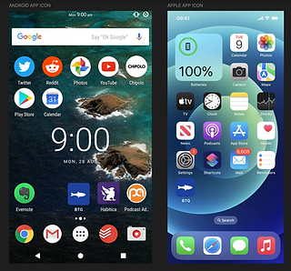
When translating the Beyond the Glass brand into an app icon, my goal was to create something that was instantly recognizable, clean at small scales, and consistent with the larger brand identity. By avoiding unnecessary complexity, the fish becomes a bold, memorable symbol that communicates “aquarium” at a glance. The fish is the same element integrated into the main logo, which builds brand consistency across all touchpoints.
Cross-Platform Scalability
As shown in both Android and iOS mockups, the icon works seamlessly across platforms. On Android, it stands out clearly in a crowded grid of colorful, detailed icons. On iOS, its minimal silhouette fits well with Apple’s clean aesthetic, holding its own alongside native apps like Settings and Health. The design is flexible enough to scale between app icons, navigation tabs, and other digital contexts.
APP DESIGN

I dedicated three months to an iterative design process that combined creativity with validation. I began with thourough sitemapping and wireframing, sketching out multiple variations of layouts and user flows to understand how visitors would naturally interact with the app.
I conducted rounds of user testing, observing how real people navigated my prototypes, listening to their feedback, and using those insights to make thoughtful adjustments. This cycle of designing, presenting, and testing allowed me to uncover what worked best, what needed to evolve, and ultimately shaped the app into a solution grounded in both research and real user needs.
Sitemap

The sitemap is broad at the top (Scan, Kid Mode, Conservation, Profile, Home, Search, My Account, Login, Map), which gives users clear entry points.
Each section branches into deep, content-heavy structures (e.g., Conservation → Feed with Updates → Endangered List, Rescue Stories, etc.). This is good for rich exploration, but it risks overwhelming users if navigation isn’t streamlined.
Consistency: Profile appears twice (standalone + under My Account). This could cause confusion — consolidating these might improve clarity.
My Workflows
-
Scan → Upload Photo → Animal Profile Page
-
Very direct and user-friendly. The scan flow feels like the primary feature and is designed to deliver quick gratification.
-
-
Kid Mode → Scavenger Hunt / Quizzes / Flashcards / Rewards
-
Nicely gamified and tailored to younger audiences. Clear motivation loops (learn → play → reward).
-
-
Conservation → Updates / Rescue Stories / Ways to Get Involved
-
This is a mission-driven pathway. Great for aligning with emotional design — users who care about conservation get narrative-rich, value-building content.
-
Paper Lo Fidelity Wireframes
Workflow 1: Scan

Workflow 2: Kid Mode

Workflow 3: Conservation Updates

Profile Section:

Elevator Pitch
For kids, adult aquarium visitors, and conservationists who want a more engaging and interactive way to connect with marine life, Behind the Glass is an educational aquarium app that combines scanning technology, gamification, and real-time conservation updates to create an immersive aquarium experience. Unlike Fathomverse, which focuses on VR-based exploration, PictureFish, which is limited to fish identification, and JellyWatch, which centers on citizen science tracking, Behind the Glass enhances real-world aquarium visits with interactive learning, personalized rewards, and exclusive conservation insights.
Digital Low Fidelity Wireframes
Workflow 1: Scan

Workflow 2: KidMode

Workflow 3: Conservation

Home Screen Brain Drawings
These are just quick 5 minute sketches of the home screen to try out different ways people will first interact with the home screen .


The first sequence of pages explores different navigation approaches for the app. The first concept begins with a central scan page, with an expandable menu for exploring additional functions. The second concept simplifies the experience by opening directly to a landing page with the three core app functions, essentially acting as a straightforward navigation bar. The third concept experiments with button composition while also introducing a profile button, giving users a more personalized entry point.
I ultimately chose idea #2 because it balances personal progress (visit history, kid updates) with immersive discovery (species map), making the homepage feel both useful and engaging right away.
Workflow Digital Wireframes
Workflow 1: Scan


Scan Feature
Balancing Personal Progress with Exploration
The homepage leads with personalized context, past visits and KidMode progress, then invites exploration through a species map highlighting global animal connections. An underwater gradient reinforces the aquarium theme, while a fixed bottom nav keeps core features (Home, Scan, Kids, Updates) easily accessible.
Making Discovery Interactive
The scanning screen turns the aquarium visit into an active moment of discovery. A live bounding box lets users "capture" species in real time, with instant feedback ("Looks like Sally, tap to see") guiding the next step. Options to take a photo or upload one add flexibility, making learning feel game-like and turning the visit into a hands-on, memorable experience.
Storytelling + Education.
After identification, the user lands on a species profile that blends scientific accuracy with storytelling. Giving each animal a name, age, and personality traits builds emotional connection, especially for kids. Information flows from quick personal facts: species/conservation details, playful personality, appealing to both casual visitors and those seeking depth. A circular hero image keeps the animal as the visual centerpiece.
Workflow 2: KidMode


Kids Mode
Entry Point
The Kids Mode offers three clear paths: Marine Twin Quiz, Games, and Rewards. The layout is kept simple with bold icons and minimal text so children can easily navigate. Whimsical illustrations of sea life (jellyfish, whales) anchor the design in the underwater theme.
Design Strategy
Kids Mode is designed around three principles.
-
Engage: Simple games and quizzes keep children curious and entertained.
-
Personalize: By giving marine life names and personalities, the app makes education more relatable.
-
Reward: Real-world incentives strengthen motivation and create unforgettable experiences.
Together, these elements ensure Kids Mode is more than just a side feature, it’s a core part of the app’s mission to educate and inspire children and ease the aquarium experience for parents.
Workflow 3: Conservation Updates


Conservation Section
To extend the app’s impact beyond scanning and games, I designed an Updates section that connects visitors to real-world conservation efforts. The goal was to move users from passive learning toward active participation, whether that means staying informed, attending events, or volunteering.
Updates Hub: Stories, Events, and Opportunities
The Updates hub is designed to feel like a dynamic newsfeed. At the top, users see highlights of recent conservation wins, such as rescued sand sharks or baby sea turtles released after storms. Below, upcoming opportunities like beach cleanups and volunteer programs are displayed with clear dates, locations, and calls to action. The mix of narratives and actionable items ensures both casual visitors and motivated advocates can engage at their own pace.
Expandable Content: Depth Without Overwhelm
Each card in the feed is tappable, leading to a dedicated page for deeper detail.
For example:
-
A conservation story expands into a full article with images, offering transparency into the rescue process.
-
A beach cleanup expands into a list of upcoming and past events, encouraging repeat participation.
-
A volunteer program expands into details with a clear “Sign Up!” button, making commitment easy.This progressive disclosure design keeps the homepage clean while still supporting users who want to dig deeper.
Design Strategy: From Awareness to Action
The Conservation & Updates flow is guided by three principles:
-
Inform: Provide digestible, real-time stories about conservation efforts.
-
Engage: Use visuals and headlines to spark curiosity and empathy.
-
Activate: Offer clear, actionable opportunities (cleanups, volunteer programs) to turn awareness into hands-on involvement.
Final App Walkthrough
Watch the video below to watch how the app comes together!