
CARE TEAM FEATURE, DEXCOM FOLLOW
Company
Not Affiliated Concept for
Dexcom
Role
UX Designer
Timeline
2 Months
Figma · Healthcare Design · Existing System Design · UX writing · Multi-device design
OBJECTIVE
I set out to design a feature for the Dexcom Follow app that helps parents of young children with type 1 diabetes answer two questions fast: "Do I need to act?" and "Is someone already handling it?" when monitoring glucose levels during the school day and at home.
SOLUTION
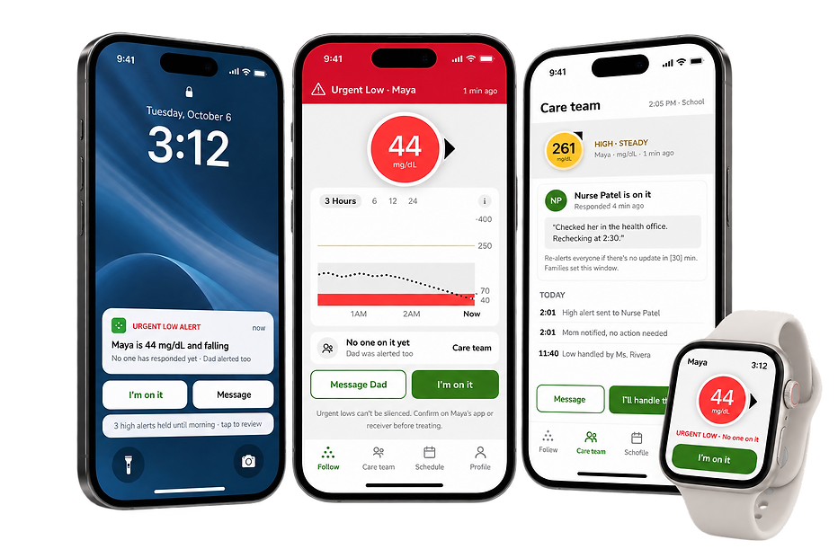
Care Team turns Dexcom Follow from a feed of alerts into a shared line of communication between everyone caring for a child. Every alert shows who is already responding, so parents and school nurses can claim it, leave a quick note and hand it off without a single phone call.
RESEARCH
I started by studying what caregivers already say about following a child's glucose: App Store reviews of the new Follow app, published studies on parent sleep and school monitoring, and a comparison of caregiver apps. I wanted to understand what wakes parents up, what they check first, and where coordination with school staff breaks down.
App Store Review Analysis
23 reviews of the new Dexcom Follow app,
Jun 2025 – Aug 2026
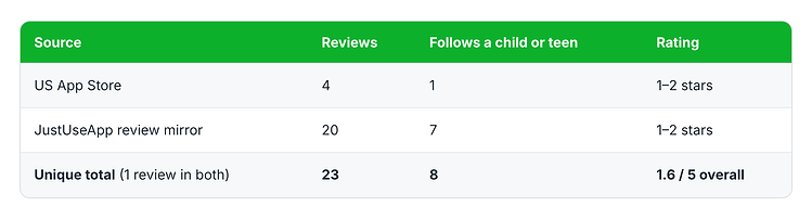
This told me caregivers weren't unhappy with remote monitoring itself. Research shows it lowers parents' fear of lows and improves their sleep. They were unhappy that the new app made it harder to see a reading and trust that alerts would reach them.The strongest complaints weren't about missing data. They were about effort and uncertainty: opening the app just to see a number, not knowing whether an alert had arrived, and alerts that kept firing after a low was already treated.
Published Research
3 studies on caregivers of kids with T1D

Competitive Scan
Dexcom Follow, Gluroo, LibreLinkUp, Sugarmate
Gluroo was the closest precedent: its alerts go to the person with diabetes first and escalate to the family "crew" only if nothing happens.
No app I reviewed let school staff and parents see who was handling an alert inside the CGM maker's own follower app.


Key insight:
Caregivers don't need more alerts. They need to know, in one glance, whether an alert still needs them.
Caregivers in the reviews and studies checked readings throughout the day, but in different ways:
Glancing: checking the lock screen or home screen widget without opening the app
Wrist checks: reading the number on an Apple Watch complication
Driving: seeing readings through CarPlay on the way to pickup
Verifying: checking minutes since the last reading to spot a glitch
Coordinating: school staff calling the parent after a high or low, and parents watching to see if anyone responded
Pain Points
A number isn't a decision
Alerts show a reading, but not whether it's already correcting or still needs someone. Half-asleep parents have to work that out themselves.
About 44% of surveyed caregivers respond right away only to very high or low alarms; reviewers miss the old "minutes since last reading"
Alerts never stop, even after treating
Repeat alerts keep firing after a low is handled, so caregivers learn to tune them out.
About 25% of caregivers become indifferent to repeated alarms; 1 review
Followers lack synchronicity
Every follower gets every alert at once, and no one can see who else got it or who's acting. Parents/Caretakers do not know who has taken action.
76% of surveyed homes have two caregivers; about a third change settings to cut alarms at certain times; Follow has no shared acknowledgment
When alerts are frequent and can't be resolved, caregivers start tuning them out: about a quarter of surveyed caregivers said they become indifferent when alarms repeat.
The opportunity wasn't to send fewer alerts, but to make every alert answerable: show what's happening, who's on it, and whether it still needs you.
DESIGN IMPLICATIONS
Research pointed to three caregivers the feature had to serve. Follow had to work for each of them without anyone changing settings that belong to someone else.
Parent at night: tell at a glance whether an alert still needs them, so they can decide whether to get up
School nurse: claim an alert and leave a quick note, so the family knows it's handled without a phone call.
Managing parent (the sharer): decide who gets which alerts and when, so the right person is woken instead of everyone.
Safety boundaries
-
Urgent lows always reach every caregiver and can never be snoozed.
-
Alert levels are set by the family and their care team, not by the app.
-
The design reminds caregivers to confirm readings before treating, as Dexcom already advises.
How might we...
help every caregiver know, in one glance, whether an alert still needs them?
DESIGN REQUIREMENTS
Research showed caregivers don't need more alerts; they need alerts they can resolve together. These two requirements guided every screen:
1
2
Every alert must show its current state at a glance: the reading, trend, minutes since the last reading, and whether someone is already responding.
A caregiver who takes an alert must quiet it for everyone else, without ever hiding an urgent low.
DESIGN PROCESS AND ITERATIONS
Research showed caregivers don't need more alerts; they need alerts they can resolve together. These two requirements guided every screen:
Low Fidelity Concept Sketches for Night Alerts
Week 1-2, goal: can a half-asleep parent decide to get up or not in one look?

Low Fidelity Concept Sketches for Night Alerts V0 to V1
Week 1-2, goal: figuring out what goes on the screen before how it looks
Note, "Maya" is the diabetic ch

Ideation mapping: Who has control?
Week 1-2, goal: who can see and change what, important to understand before designing

.png)
Mid Fidelity Screens
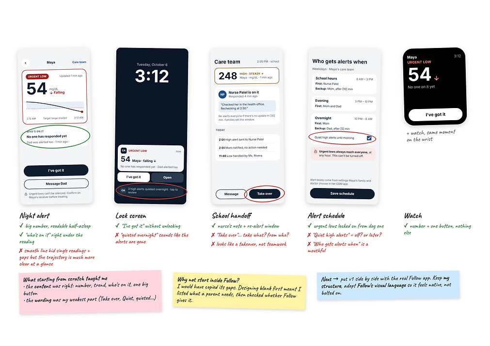
Week 3-5, goal: Before borrowing anything from Follow, I designed my own version from a blank screen. No template meant I had to decide what a parent actually needs and that made Follow's gaps easier to spot later.
"Take Over" Workflow V1
Week 3-5, My first pass at what happens once a parent takes an alert from the nurse by pressing the take over button as shown above.
.png)
.png)
High fidelity: Bringing V1 into Follow's design
Week 5-7, kept my structure from v1 and adopted Follow's visual language, so it feels like part of the app parents already use.
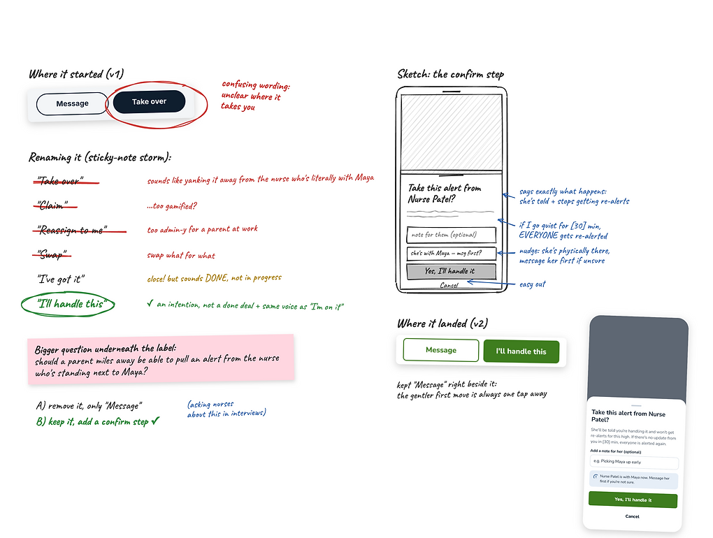
"Take over" → "I'll handle this"
Week 5-7, School handoff screen, the parent's secondary action when the nurse has already claimed the alert
Alert Schedule wire framing V1 to V2
Week 5-7, This transition from my original wire framing to the Dexcom Follow inspired one focused on wording and intrepretation

.png)
"I'll handle this" updated wire frame
Week 5-7, In V1 a handoff was one tap on "take over" and the signal "Mom took over." Now, once a parent confirms, every phone shows who has it, why, and when everyone gets re-alerted, with no further confirmation needed.
.png)
Answering my design concerns
Week 5-7, the questions in blue under the screens above show potential design gaps/concerns. This is how I addressed them.
.png)
Home screen "follow tab" screen instances
This is the landing page of the app, the goal of this screen is to "what do I need to do?" It changes with the situation: no one on it, someone on it, and handled.
.png)
FINAL DESIGN
Week 8, These are my final screen that came from all of the iterating above!
LESSONS LEARNED
In high-stakes moments, the microcopy is the interaction
A lot of my iterations after V1 were word changes, not layout changes: "Take over" became "I'll handle this," "Quiet" became "Hold," and "I've got it" became "I'm on it." Each label changed what a half-asleep parent would expect to happen when they tapped it. I learned to test every label against one question: what does someone think happens next?
Design for everyone a tap affects, not just the person tapping
When one parent takes an alert, three phones change: theirs, the nurse's and the other parent's. Mapping who can see and change what before drawing screens, and then designing each person's state after a handoff, surfaced problems a single-screen flow would have missed. It also made the safety rules concrete, like urgent lows never being silenced no matter who has the alert.
It can still be important ideate from scratch when designing for an existing product
Starting from a blank screen helped me define what caregivers needed without being anchored to Follow's current layout. But my first version felt like a separate app. The final design kept my structure and adopted Follow's patterns, colors and navigation, so a new feature would feel familiar to people who already rely on it. Now I explore freely first, then design within the system people already know.